

Score story
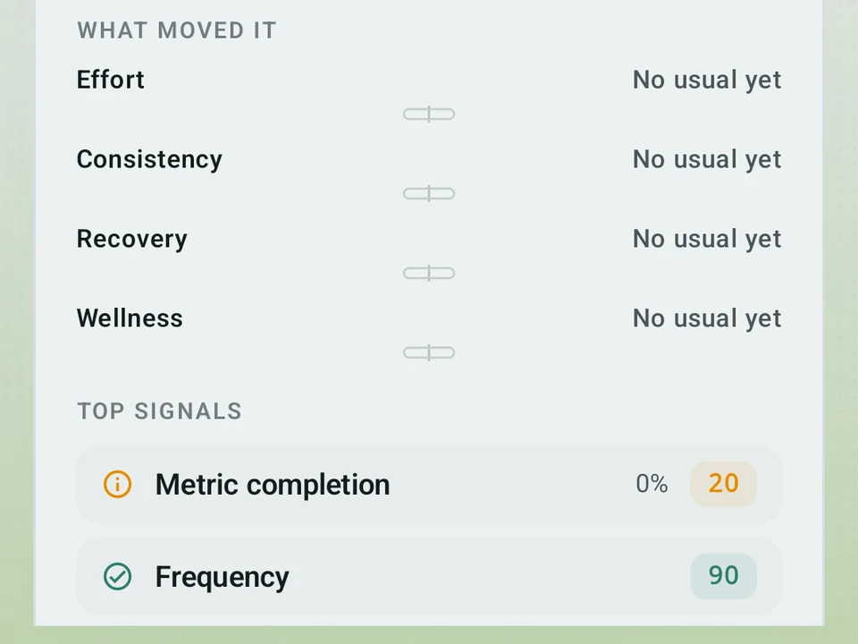
Scrub back through your Kinoku Score day by day. Each day says in one plain line what moved it, next to what is normal for you.
Real app capture
What this feature looks like with data
 Open full-size image ↗
The score with its reasons
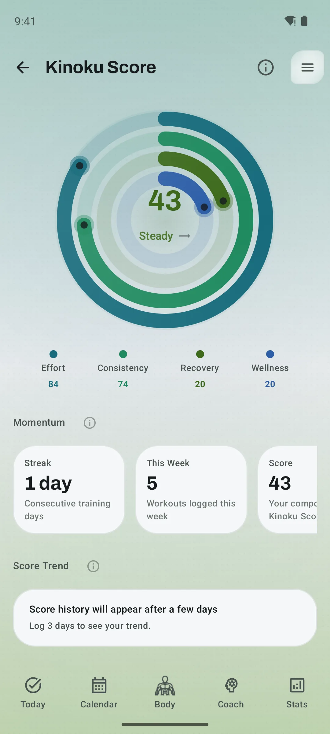
The Kinoku Score view pairs the headline number with the training and recovery signals that moved it.
One day, one sentence
Land on any day and Kinoku sums it up in plain words, then shows what pushed the score up or down against your own usual.
Tier shape
How access changes by tier
30-day and 90-day views, day-by-day scrubbing, the full day panel, the markers, and the per-signal breakdown.
1 year and All time, grouped by week. The dashed forecast includes both the 3-day and 7-day points instead of only tomorrow.
What it is
Score story is the history behind your Kinoku Score, the one number for how your training, recovery, and health are stacking up. Open it from the Pulse screen and you get a line covering every day. Drag your finger across it and the chart snaps day to day with a small buzz, while the panel below rewrites itself for whichever day you land on.
Every day gets a sentence
The panel leads with one plain line, and a Tuesday in a heavy week might read “a bit below your usual, mostly recovery,” with the drivers underneath. Four bars, one per part of the score, are each drawn against what is normal for you over the last 30 days. Bars point right when that part beat your usual and left when it fell short, so you are reading how the day sat against you rather than a raw number. On days with enough saved detail, Kinoku also lists the few signals that moved the score most and how much weight each part carried.
The chart is honest about gaps
Missing days stay missing, because the line breaks rather than drawing a smooth guess between two points you never earned. Days where the data was thin draw as a dotted line instead of a solid one. Under the main line sits a strip with one row per part of the score, shaded by how each did. A part with no data that day shows as an empty outlined box rather than folded in with the others. Tap any strip row and the chart flattens into that part alone, on its own scale, with a dashed line marking your usual.
Marks worth finding
Small shapes sit on the days that mattered. A gold star marks a personal best, a crescent marks a rest day, and a flag marks where your score crossed into a new state. They only appear on days that actually have a saved score, so a mark never argues with an empty day.
Where the detail runs out
One limit runs through the whole screen, since the panel is only as deep as the day was. A thin day gets a dotted line, an empty box for the missing part, and no list of top signals, rather than a filled-in guess.
What is free and what is not
The screen is free, and so is the scrubbing, the full day panel, and every marker. The breakdown of what each signal did is free too, along with the 30-day and 90-day views. Pro adds the long views, where 1 year and All time group your days into weeks so a couple of years still fits on one screen. Both buttons stay visible on the free plan with a small lock, so you always know they are there. The dashed tail past today is a short forecast, and free gets tomorrow while Pro adds both the three-day and seven-day points.
| FREE | PRO | |
|---|---|---|
| 30-day and 90-day views | ✓ | ✓ |
| Day-by-day scrubbing | ✓ | ✓ |
| Day panel, drivers, markers | ✓ | ✓ |
| Per-signal breakdown | ✓ | ✓ |
| 1 year and All time | - | ✓ |
| Forecast tail | Tomorrow | 3-day and 7-day points |
The free layer
The screen and the whole story are free. That covers the 30-day and 90-day views, day-by-day scrubbing, the day panel, the markers, and the per-signal breakdown. Pro adds 1 year and All time, and it adds both the 3-day and 7-day forecast points instead of only tomorrow. The free half stays free, and the wording of the daily line can still change as we tune it.
Try it for yourself.
Available on Google Play. The core here is free. Pro adds optional extras.
Get on Google PlayRelated surfaces
Once Kinoku has enough data, the Kinoku Score sums up your recent training, recovery, and health signals. Until then, it shows a learning state instead of a made-up number.
Coaching screens that run on your phone and explain what changed in your training and why it matters.
The lead card on the Coach screen shows how fresh or tired you are right now. One Form line sits over three soft bands: Fresh, OK, and Tired, with a state pill beside it. Tap Show fitness details for the fitness and fatigue lines behind it. The base chart is free for all. Pro adds forecast lines and a note in plain words.