

Run Analytics
Pace-colored runs, GPS splits, VO2 max, and race times. No Kinoku history cloud; maps, weather, and eligible Android backup use external services.
Real app capture
What this feature looks like with data
 Open full-size image ↗
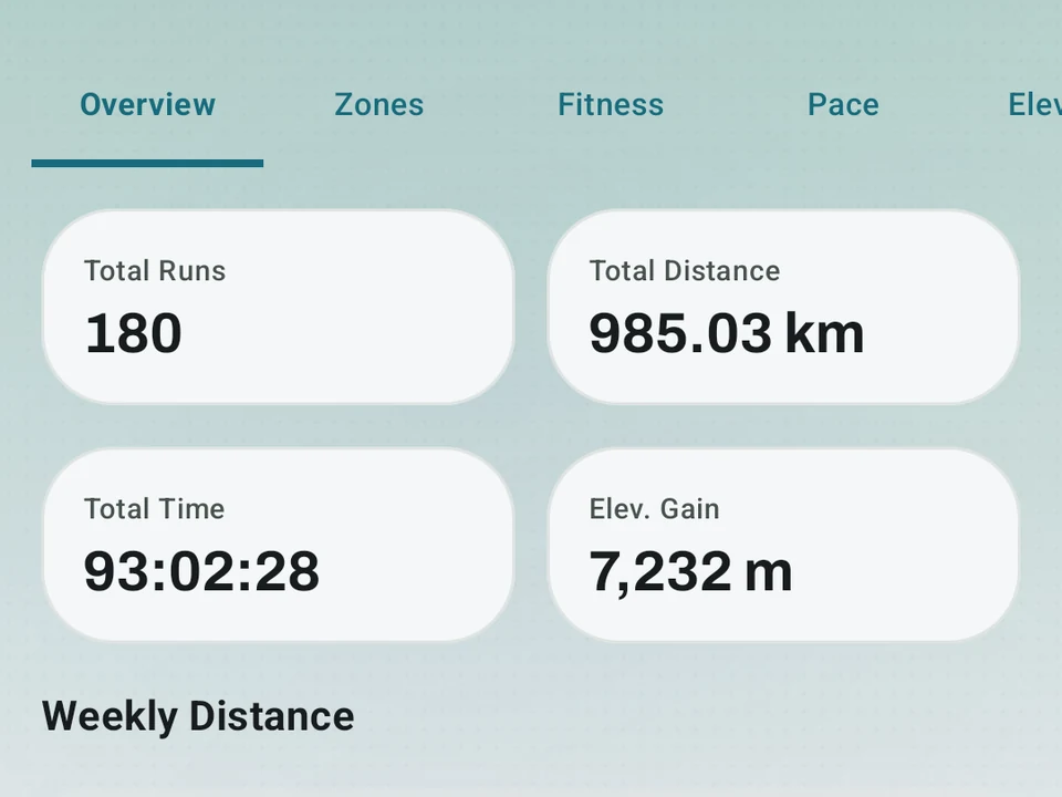
The running hub
Real capture. Recent runs, a route heatmap, weekly distance, and shoe mileage on one screen.
 Open full-size image ↗
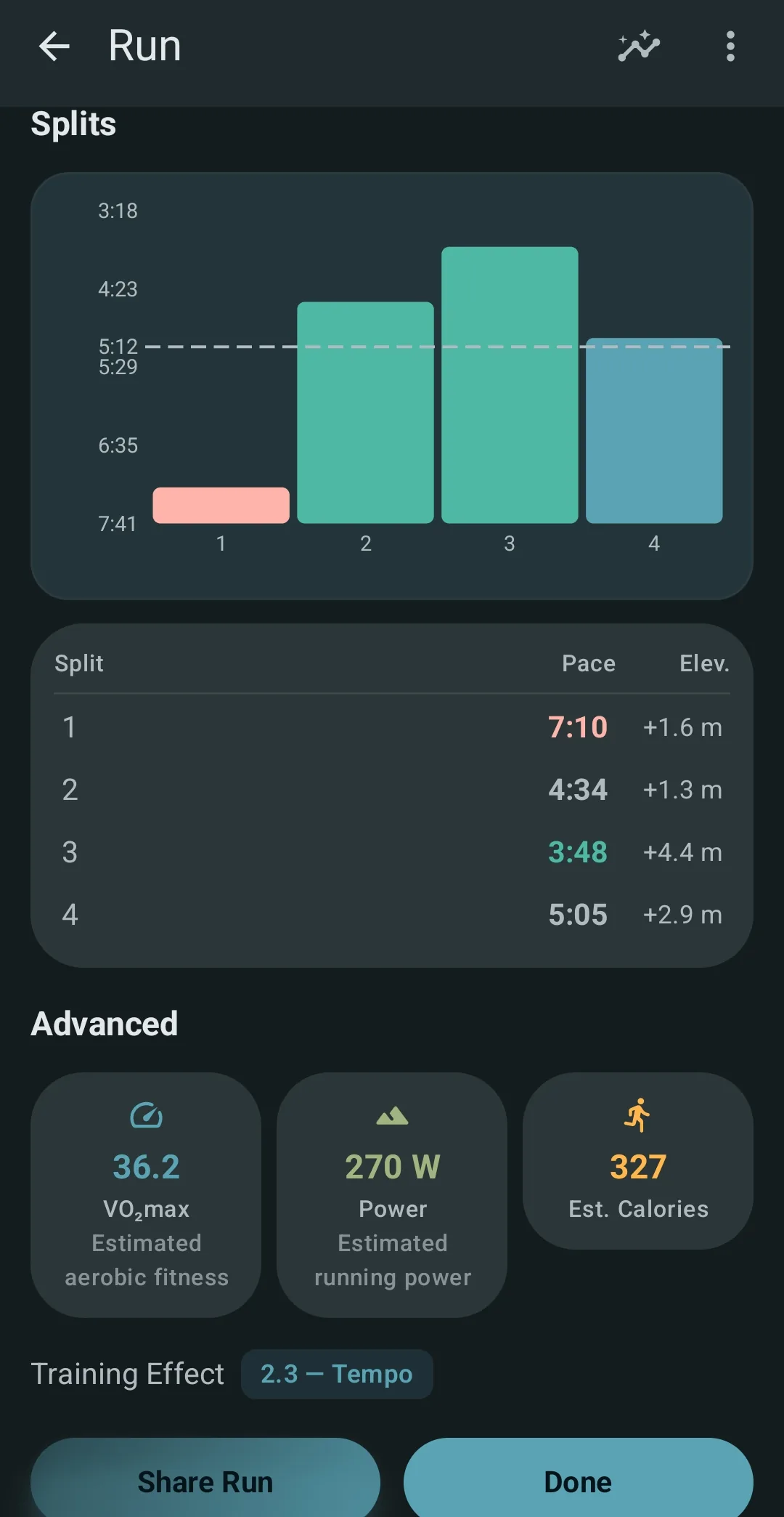
Splits and effort
Real capture. One run breaks into splits, with pace, a fitness estimate, and how hard it felt.
What it is
Deep stats on how you run: Run Analytics turns a tracked run into splits, best efforts, and trends, with the recording done by GPS, the reading done on your phone, and no mandatory account or leaderboard. Kinoku does not upload your route history to a Kinoku-hosted training-history cloud, and your routes are eligible main-app data that Android system backup can copy into your Google account. Optional map, weather, and sharing requests follow the Privacy Policy.
The example carried through this page is a run you rate as Hard when it ends, because the felt rating is where the numbers and your own read of the day meet.
What you get
On every run, on its own:
- Splits for each kilometer or mile. Each split shows your pace, heart rate, and elevation.
- Your best efforts over 1 km, 1 mi, 5 km, 10 km, half, and full, found inside any run.
- VO2 max (your body’s top rate of oxygen use), estimated from your heart rate and pace.
- A pacing score, which shows how even your pace was.
- A power guess from your pace and the slope.
- Calories burned, from your weight, your distance, and the climb.
On the Run Dashboard, across all your runs:
- An 8-week training load chart.
- A pace trend for each distance.
- Race time guesses for 5K, 10K, half, and full marathon.
- A best-efforts list, you against yourself.
- A weekly Zone Training summary, covered on the Zone Training page.
How one run is scored for training load, with or without a power meter, is on the page comparing training impulse with training stress score.
Rate how a run felt
After a run, Kinoku asks one quick question, which is how did that feel, and you tap Easy, Moderate, Hard, or Max. That answer turns into a 1 to 10 effort rating, and it is free on every run.
The old Effort card is now the Intensity card, which reads your run from the data and stays an observation rather than a verdict. Your felt rating sits next to it, so when the run you rated Hard reads as an easy day in the data, Kinoku says so. An easy day that felt hard, or your first run back after a break, both show up here, and the app points out the gap and leaves the call to you.
Pace-colored routes
Each route gets colored by pace, with green where you ran fast and red where you slowed down. The colors fit your own pace range rather than some global scale, so on that Hard run you can see the hills, the headwinds, and the spots where you faded.
Tier note: pace-colored routes work on every GPS run. The FREE tier gets them too, both on the live map and on share cards. The Run Analytics dashboard adds more on top.
The “private Strava” angle
Strava asks you to upload your runs so other people can see them, and Kinoku does the opposite. You get the same kind of stats, like splits, VO2 max, race times, and route maps, while your run history is not sent to a Kinoku server. Map tiles and weather context are the only parts that use the network, which is the edge worth knowing before you call it offline.
Part of Pro
The per-run dashboard is Pro, while recording the run stays free: the GPS trace, the distance, the pace, and the map. Pro is a deeper read on runs you already own. The free recording is the fixed part, and the set of Pro readings is the current one, so a Hard run logged today keeps its trace whatever the dashboard adds later.
Related surfaces
Live pace, splits, a route map, and audio cues. Your run record is not uploaded to Kinoku; map tiles load when you view maps, and weather is a clear opt-in.
Pace zones, easy-versus-hard balance, and a training effect score built into your runs.
A multi-run map with All Time, 30 Days, 90 Days, and 1 Year filters, five basemap styles, whole-route average-pace colors, and snapshots to share.