

ACWR Explained: What the Ratio Tells You
ACWR compares this week's training load to your last month. Where the sweet spot came from, why researchers pushed back, and how to read the number.
Kinoku in practice
Where this shows up in the app
 Open full-size image ↗
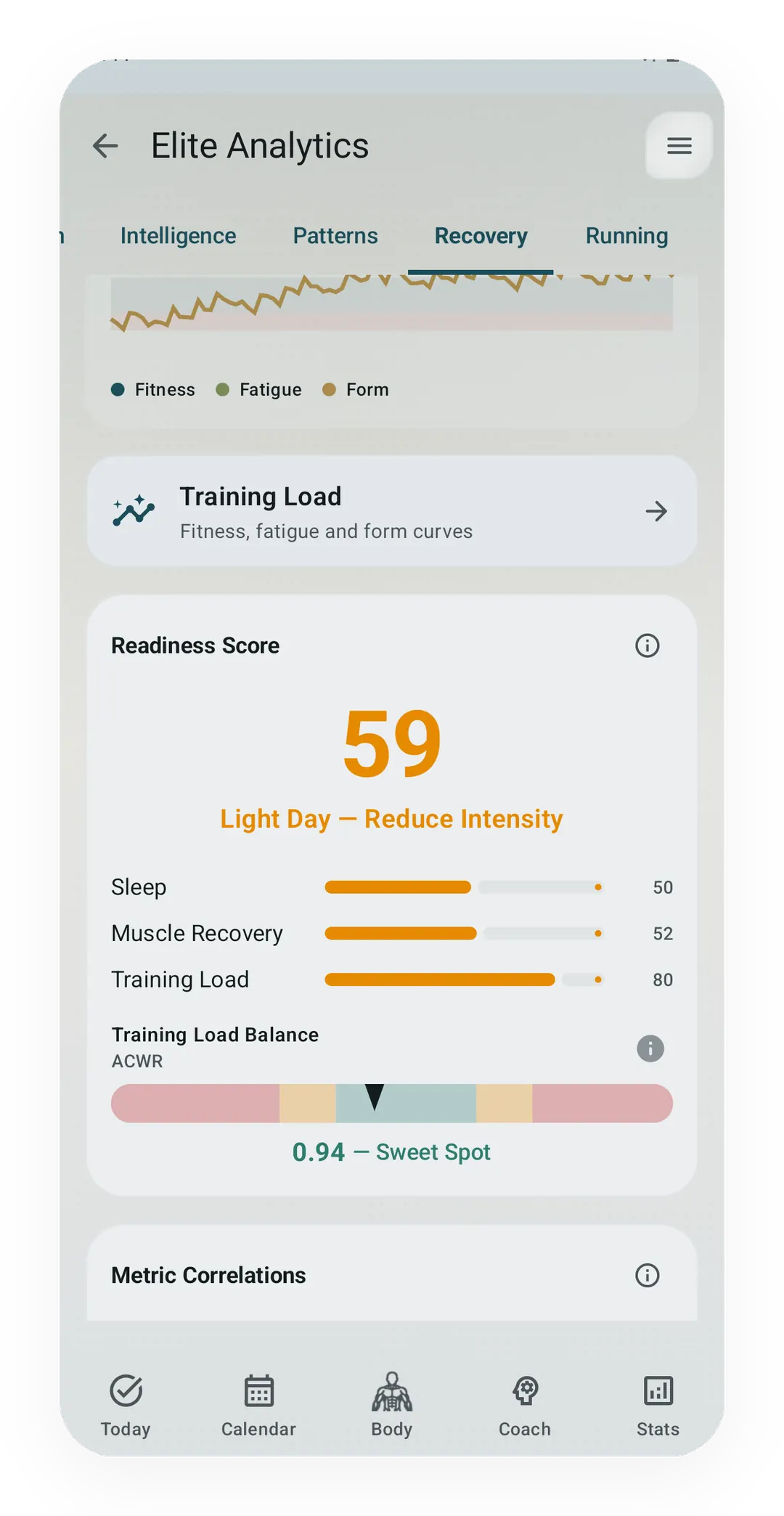
ACWR inside the app
The lift-only Recovery gauge presents the current ratio with its recent-load context and warning band.
Quickstart
The acute-to-chronic workload ratio (ACWR) compares how much you trained in the last 7 days against your average over the last 28 days. A ratio near 1.0 means this week looks like your recent normal, and much above that means you jumped up fast.
The bands people quote come from Tim Gabbett’s 2016 work:
- Under 0.8: doing less than usual
- 0.8 to 1.3: the “sweet spot”
- 1.3 to 1.5: a real jump
- Above 1.5: a big jump
Read it as a flag rather than a verdict. The research behind those exact cutoffs has taken serious criticism since 2019, and the ratio was never meant to predict any one person’s injury.
The ACWR calculator takes 28 days of load values and works it out in your browser.
What the ratio is
Two averages, divided:
Acute load (A)   = mean of the last 7 days of load
Chronic load (C) = mean of the last 28 days of load
ACWR = A / C
That is the whole thing, and the value of it is not the arithmetic but what the two windows stand for.
The 28-day window is a rough stand-in for what your body is used to, while the 7-day window is what you just asked of it. Divide one by the other and you get a change signal: is this week in line with your recent normal, or well outside it?
What counts as “load”
Anything, as long as you use the same unit for all 28 days. Common choices:
- Session RPE × minutes. RPE, short for rate of perceived exertion, is how hard it felt times how long, and it needs no gear.
- TRIMP (training impulse). A heart-rate weighted score.
- TSS (training stress score). Common in cycling and running software.
- Tonnage. Sets times reps times weight, for lifting.
What does not work is distance, because kilometres run tell you nothing about how hard those kilometres were. Ten easy kilometres and ten at threshold are the same distance and very different stress, so if your ACWR runs on mileage it will call a hard week and an easy week identical.
This matters for how you read mileage-based ramp rules elsewhere, which answer a simpler question than ACWR does.
Where the sweet spot came from
Gabbett’s 2016 paper pulled together studies in rugby, cricket, and Australian rules football. The pattern was consistent: injury rates were lowest when acute load sat close to chronic load, and rose when athletes spiked well above it.
The headline result was appealing because it flipped the usual advice: high chronic load was protective. Athletes who had built up a big steady base handled hard weeks better than athletes who had not, so the risk was not training more but training more suddenly.
The framing is still useful, and it is the part that has held up best.
Why researchers pushed back
From about 2019 onward the specific cutoffs came under real criticism, and three problems come up repeatedly.
The maths is partly self-fulfilling, because acute load is inside chronic load, since the last 7 days are part of the last 28. Dividing a number by something that contains it creates a relationship on its own before any biology, and Wang and colleagues showed this can make an effect look bigger than it is.
The window lengths are arbitrary, since nothing about human tissue says 7 and 28. Those numbers came from convenience, and if you change them the results change with them.
A plain average treats all days alike, so in a rolling mean a session 27 days ago counts exactly as much as yesterday’s, which is not how fatigue works. An exponentially weighted moving average, which leans on recent days more, tracks better in most later work, and some studies now report both.
Impellizzeri and colleagues went further and questioned whether the ratio should be used for individual decisions at all.
So is it worth watching?
Yes, it is worth watching, as long as you trim the claim down to what it can actually support.
What ACWR is good at is spotting that something changed quickly. If your ratio moves from 1.0 to 1.8 in a week, that is worth noticing, not because injury is coming but because the speed of the change is real information about your week.
What it is not good at is telling any one person what will happen to them. It came from squad-level data in team sports, and those population patterns do not transfer cleanly to your Tuesday.
Most coaches now treat it the way they treat a warning light: it tells you where to look, not what to do. It also cannot see the things that matter just as much, like sleep, stress, illness, whether you changed shoes or surfaces, or how the tissue feels.
ACWR and Form are different questions
ACWR often gets confused with TSB (training stress balance), the form number from the Banister model, and the two are cousins rather than twins.
| ACWR | TSB (Form) | |
|---|---|---|
| Maths | Acute load ÷ chronic load | Fitness − fatigue |
| Reads as | How fast did the load change | How fresh am I right now |
| Good value | Near 1.0 | Depends on the goal |
| Best used for | Spotting sudden jumps | Timing a peak |
You can be fresh and still show a high ratio, as in race week when you cut volume but do one sharp session. The volume drop lifts your form while the hard session spikes your acute load, so both readings are correct and they answer different questions. Which of the two reacts first, and why, is the subject of ACWR vs the fitness-fatigue model.
Track this in Kinoku
Kinoku has two workload-ratio surfaces, and they should not be confused. The Pro Analytics Recovery tab uses completed lifting tonnage only: the last 7 days divided by the weekly average of the last 28 days, and runs and walking do not enter that gauge.
Kinoku Score uses a separate unified ratio: the 7-day fatigue average divided by the 42-day fitness average on the app’s TSS-equivalent load stream. That stream can include gym work, runs, brisk walking, and supported time-based sessions, and both calculations run on your device. Both surfaces live in the Android app, and there is no cloud sync between devices.
The Form Band uses the same unified fitness and fatigue stream as the Score ratio. Read the lift-only Recovery gauge as a view of lifting ramp, and the unified curve as whole-training context.
You can also paste a load series into the ACWR calculator here without installing anything.
References
Track this in the app
Pro Analytics
A Pro hub with five core tabs, plus a Cycle tab when cycle tracking is on. Its 20+ features include strength scores like DOTS, IPF GL, Wilks, and FFMI, the Banister Form Band, plateau alerts, ACWR, muscle balance, and cycle links.
Core tracking works offline, with no mandatory account.
Related features
A Pro hub with five core tabs, plus a Cycle tab when cycle tracking is on. Its 20+ features include strength scores like DOTS, IPF GL, Wilks, and FFMI, the Banister Form Band, plateau alerts, ACWR, muscle balance, and cycle links.
A fitness-and-fatigue curve built from the same published family of impulse-response models made popular by TrainingPeaks, and it works across gym, run, and brisk-step load.
Once Kinoku has enough data, the Kinoku Score sums up your recent training, recovery, and health signals. Until then, it shows a learning state instead of a made-up number.