

ACWR vs Fitness-Fatigue Model: Which Warns You First
ACWR flags a fast ramp first. The Banister Form curve tells you if you are fresh. Here is how each one reacts, and where Kinoku shows both.
Kinoku in practice
Where this shows up in the app
 Open full-size image ↗
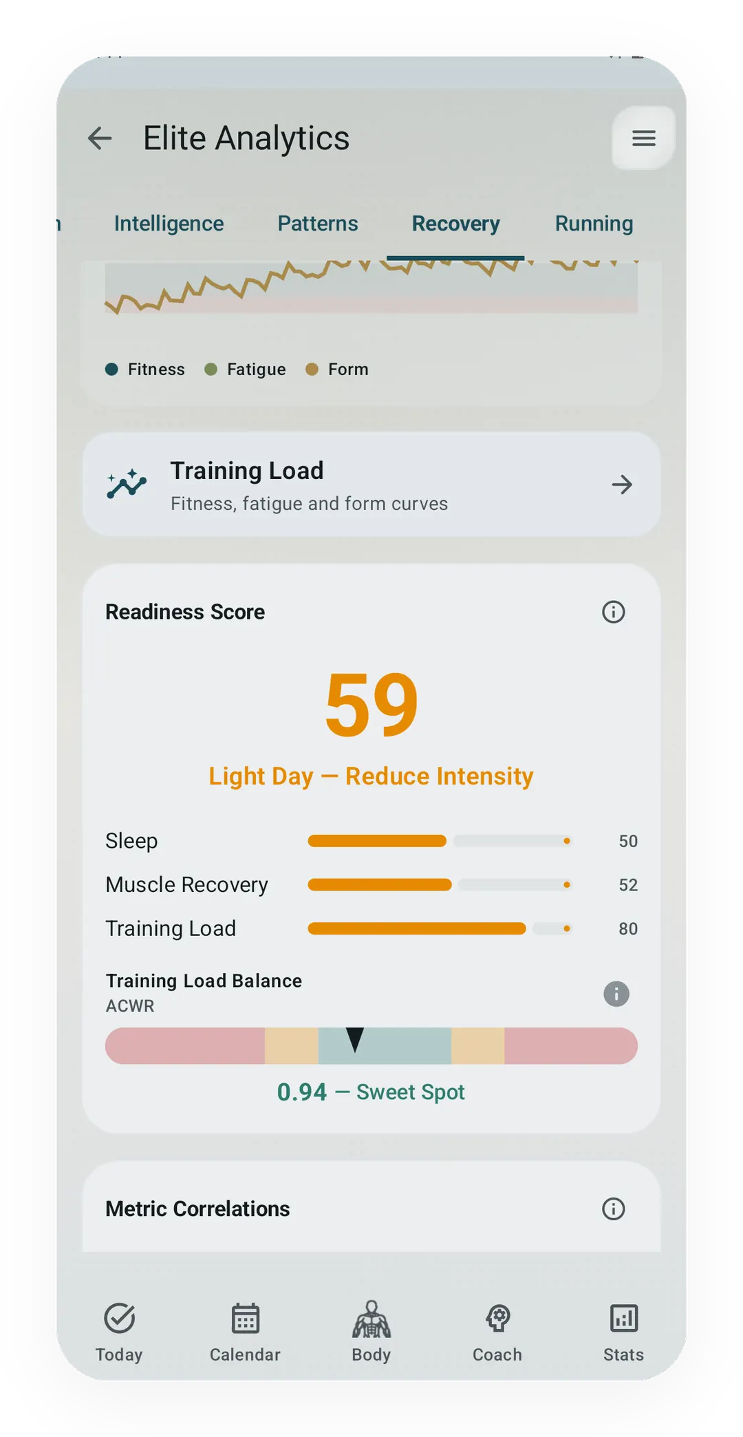
The ratio, lifts only
The Recovery gauge in Pro Analytics reads the last 7 days of lift tonnage against the last 28. Runs and walks do not enter it.
 Open full-size image ↗
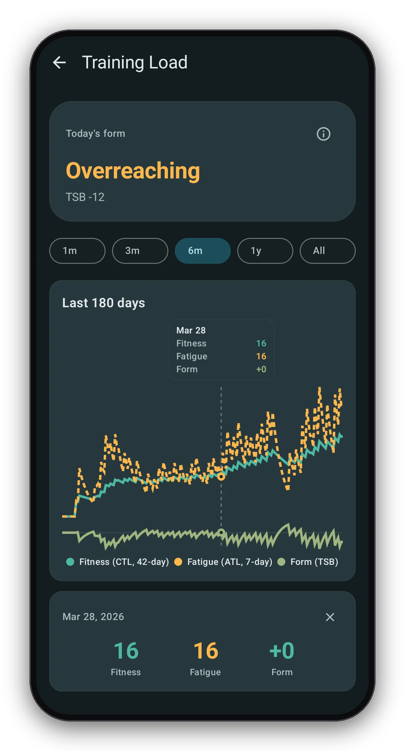
Fitness, fatigue, and form
The Training Load screen draws the Banister curve from gym, run, and brisk-step load. Form is the gap between the two lines.
Quickstart
The acute-to-chronic workload ratio (ACWR) warns first about a fast ramp, because it divides this week’s load by your usual load, so a jump reads as a jump. The Form curve is slower to call anything a problem, since negative form is normal in a hard block. Kinoku shows both, with the ratio inside Kinoku Score and the Recovery gauge, and training stress balance (TSB) in the Form curve.
What each model measures
The ratio is the simpler of the two, since you take the load from the last 7 days and divide it by the load you normally carry over a longer window, which is classically 28 days as a plain mean.
ACWR = acute load (last 7 days) / chronic load (last 28 days)Near 1.0 means this week looks like your recent normal, and the ratio has no units, so a reading of 1.4 says the same thing for a beginner as it does for a full-time athlete. The ACWR page covers the bands and the pushback against them.
The fitness-fatigue model is a difference rather than a ratio, and Eric Banister wrote it in 1975. Each day, two smoothed averages take in that day’s load: a slow one called chronic training load (CTL), which stands for fitness, and a fast one called acute training load (ATL), which stands for fatigue. Form is fitness minus fatigue.
CTL(t) = CTL(t-1) × e^(-1/42) + load(t) × (1 − e^(-1/42))
ATL(t) = ATL(t-1) × e^(-1/7)  + load(t) × (1 − e^(-1/7))
TSB(t) = CTL(t-1) − ATL(t-1)
Unlike the ratio, form carries units, counted in load points, so a form of −15 is a bigger deal at a fitness of 40 than it is at a fitness of 120. The Banister page walks through five curve shapes.
The two share a clock, since both watch the last 7 days, and they differ only in what they compare that week against and in how they report it.
Side by side
The ratio and the curve on one grid, from the math each one runs to the change each one cannot see.
| ACWR | Fitness-fatigue (CTL, ATL, TSB) | |
|---|---|---|
| Origin | 2014 to 2016, team sport injury data | 1975, swimmers |
| Math | Recent load ÷ usual load | Fitness − fatigue |
| Windows | 7 days over 28 days, or two smoothed averages | 42-day and 7-day constants |
| Units | None, it is a ratio | Load points |
| Reads as | How fast did load change | How fresh am I today |
| Warns about | A sudden ramp up | A long stretch of fatigue over fitness |
| Good value | Near 1.0 | Depends on the goal |
| Blind spot | Cannot see a slow grind | Cannot tell a ramp from a normal hard block |
| Standing | Disputed since 2019 | Old and stable, but a summary, not a measurement |
Which one warns first is usually the ratio, for three reasons that all come back to how each model is built.
The ratio asks one question only, which is whether load jumped, so a hard week pushes it up at once. Form sees the same week as a dip, and form dips in every hard block, which means one dip on its own is not a warning.
The classic ratio is also unsmoothed, because your last 7 days go in as a plain sum, so one big week moves it right away. The Banister fatigue line is a smoothed average instead, which moves less on day one and then keeps moving all week.
The ratio scales with you and form does not, so at a low fitness a small jump barely moves form, while that same jump, read as a share of your normal week, can still spike the ratio.
There is a catch, because the classic ratio also forgets fast: when a rest week drops out of the 28-day window, the ratio can spike with no change at all in your training. Kinoku’s Score version uses smoothed averages instead, which avoids that jump.
The ratio is disputed too. Gabbett’s 2016 paper made it popular, and in 2021 Impellizzeri and colleagues argued that it should be dropped, because the math creates part of the pattern on its own: the last 7 days sit inside the last 28. Read the ratio as a ramp flag rather than a forecast.
Which one Kinoku shows you, and where
Kinoku runs both models on your phone, and here is what each surface uses, as of September 2026.
- The Form curve uses the Banister model with a 42-day fitness constant and a 7-day fatigue constant. Form on any day is yesterday’s fitness minus yesterday’s fatigue, the same rule TrainingPeaks uses. The load stream is unified, so gym sessions, runs, other timed cardio, and brisk steps all feed one curve. The base chart on the Coach screen is free, while the forecast tails, the plain-words note, and the 90-day Form Band in Pro Analytics are Pro.
- Kinoku Score carries a ratio built from that same curve, dividing the 7-day fatigue line by the 42-day fitness line. Both lines are smoothed, so a rest week leaving the window causes no jump, and the value is clamped to 0 to 5. Inside the Score, 0.85 to 1.15 scores best, while below 0.5 or above 1.8 scores lowest. The ratio is null until the fitness line has a real value, and the Score labels the signal “cold start” until you have logged 3 workouts.
- The deload insight in Kinoku Score can fire when that ratio reaches 1.5 or higher, though readiness and form are checked first, with form flagged at a TSB under −25 and again under −15, so the ratio is the fallback.
- The Recovery gauge in Pro Analytics uses lifts only, dividing the last 7 days of completed tonnage by the 28-day tonnage split into four weeks, so runs and walks do not enter it. Its zones follow Gabbett, where 0.8 to 1.3 is the sweet spot, under 0.6 reads as undertrained, and 1.5 marks pushing. With no chronic load yet, the gauge shows 1.0.
One limit is worth stating plainly, because before the unified load stream exists the Score falls back to a plain ratio: this week’s lift tonnage against the mean of the previous four weeks.
When to use which
Which model to read depends on what just happened in your training, and these are the common cases.
- If you just added a lot of training, watch the ratio, because it moves first, and a reading near 1.5 says the ramp was steep.
- If you are mid-block and tired, watch form, since a TSB near −15 for two weeks is a normal hard block, while under −25 for weeks is worth a second look.
- If you are two weeks from a race, watch form, because the ratio reads low as you taper, which is expected, and form rising toward zero and above is the shape you want.
- If you came back from time off, read both with care, since your chronic load is low, so any real week spikes the ratio while form reads high because there is no fatigue yet.
- If you want one number, pick form, which is the older model, is less disputed, and sees both the ramp and the grind.
Whichever you pick, read it beside how you feel, because both models see load only and neither can see sleep, stress, illness, or a sore knee.
Track this in Kinoku
The Training Form curve draws fitness, fatigue, and form from your own log on the Coach screen, and the base chart is free. Form Band in Pro Analytics adds the 90-day view with peak, overreach, and steady zones, plus the forecast tails. Kinoku Score is free and carries the smoothed ratio inside its Effort dimension, while the lift-only Recovery gauge is part of Pro Analytics.
The web tools need no install: the ACWR calculator takes 28 days of load, and the Banister simulator walks a load series through the same 42 and 7 day constants.
References
Track this in the app
Form Band
A fitness-and-fatigue curve built from the same published family of impulse-response models made popular by TrainingPeaks, and it works across gym, run, and brisk-step load.
Core tracking works offline, with no mandatory account.
Related features
A fitness-and-fatigue curve built from the same published family of impulse-response models made popular by TrainingPeaks, and it works across gym, run, and brisk-step load.
A Pro hub with five core tabs, plus a Cycle tab when cycle tracking is on. Its 20+ features include strength scores like DOTS, IPF GL, Wilks, and FFMI, the Banister Form Band, plateau alerts, ACWR, muscle balance, and cycle links.
Once Kinoku has enough data, the Kinoku Score sums up your recent training, recovery, and health signals. Until then, it shows a learning state instead of a made-up number.