

Stats & Progress
Per-exercise charts, PRs, e1RM, and volume trends. Free, with time-range filters.
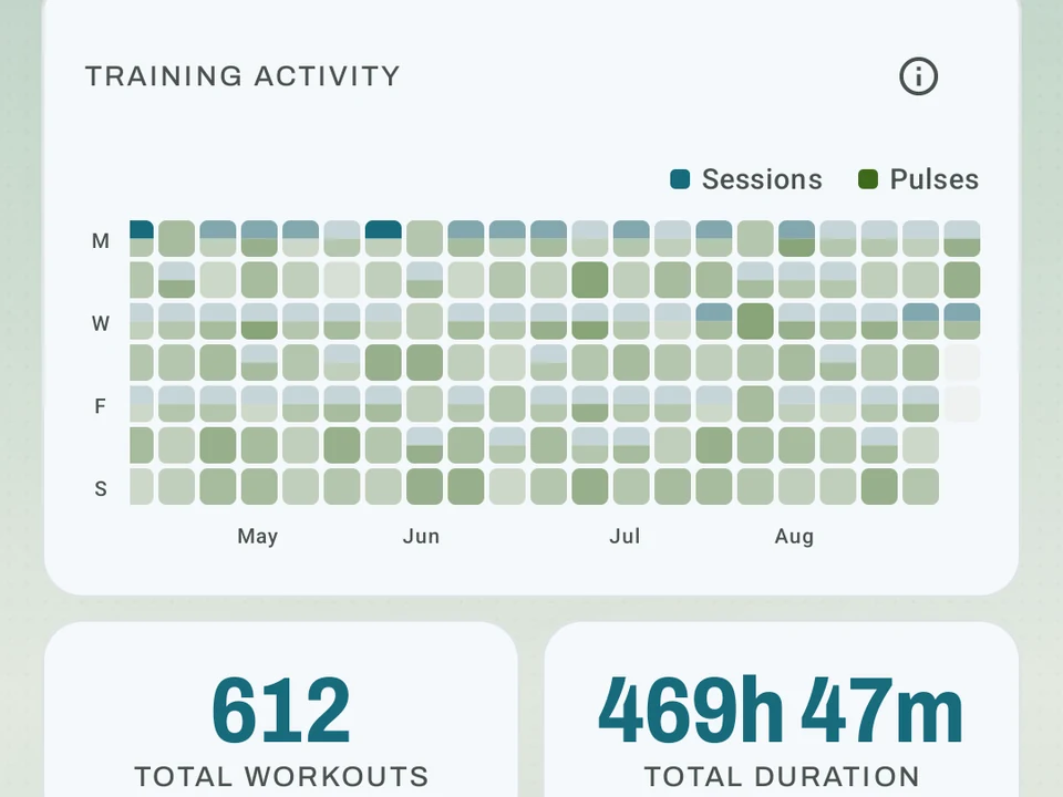
Real app capture
What this feature looks like with data
 Open full-size image ↗
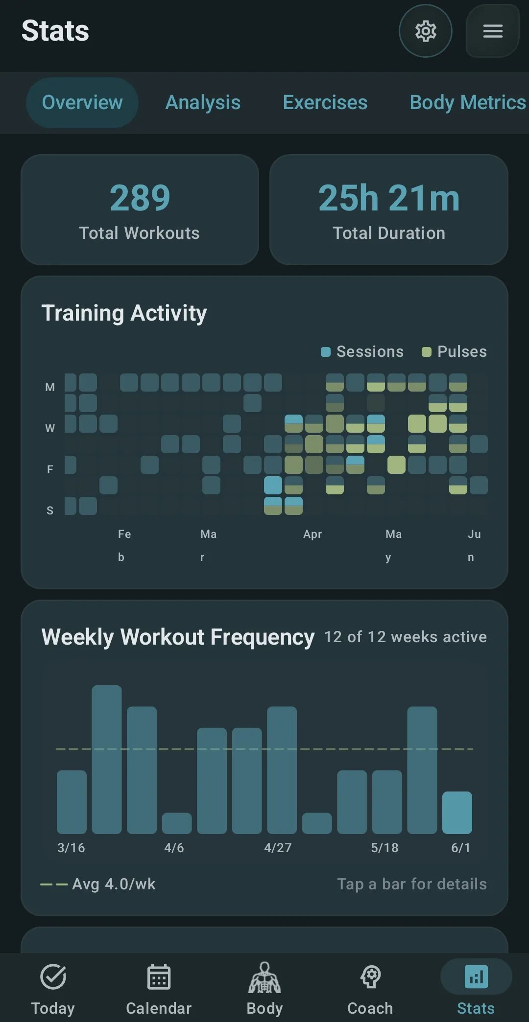
Your whole history
Real capture. Total workouts, time trained, and a map of every training day.
 Open full-size image ↗
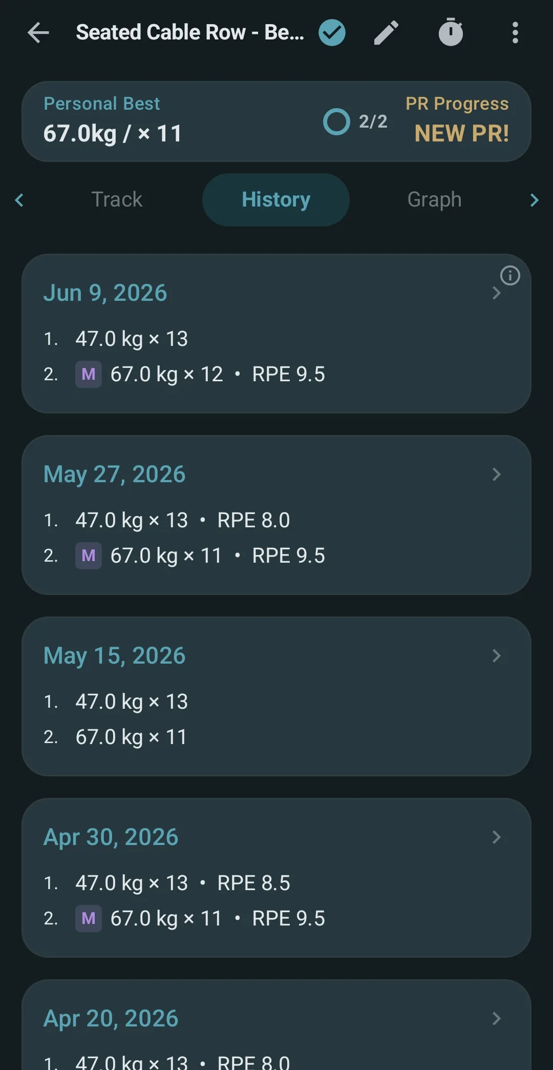
One lift, every session
Real capture. Every past session for one lift, with sets and RPE.
Tier shape
How access changes by tier
Overview totals and heatmaps, routine progress, per-exercise charts and session history, PR markers, date filters, and custom-metric charts.
Indexed two-metric overlays for one exercise, plus the general Analysis tab, exercise comparisons, set-type and rep-range distributions, the PR Timeline, strength gauges, bodyweight-relative volume, metric correlations, and insight cards.
What it is
Stats & Progress is the set of charts Kinoku draws from every exercise you log, so each lift, hold, and distance move gets its own view of how it is going. The charts show more than a bench press line over time, because they break down the kind of progress you make, and the time filters let you compare last month with last year.
People open this screen for a few different reasons, and each one gets its own chart.
The first reason is seeing one lift clearly. Say you have logged bench press for a year. Its page charts your heaviest working set week by week, draws a trend for your estimated one-rep max, and stacks up total volume across the same weeks, so a flat month shows up as a flat line rather than a vague feeling.
The second reason is seeing the whole habit. The frequency heatmap shows which days you train and which muscles get hit, while the streak counter counts logged days rather than hard days. Filtered to the last 90 days, that bench press history sits next to the weeks you skipped, which is often the real story behind a flat line.
The third reason is tracking things that are not lifts. Custom metrics such as bodyweight, sleep, or mood live in the same stats and feed the wellness part of your Kinoku Score.
What you can see per exercise
- Top set over time: your heaviest working set, charted week by week.
- Best one-rep lift (e1RM): a guess at the most you could lift once, drawn as a trend. The guess uses set weight and reps, with the Epley formula. The Epley vs Brzycki page shows why.
- Total volume: weight times reps across all sets, week by week.
- Charts that fit the move: hold exercises like plank, dead hang, or wall sit chart your best, total, and average time. Bodyweight rep work charts your best and total reps. Distance work charts your best and total distance. Each exercise shows the chart that fits how you log it.
- Two metrics, one timeline (Pro): overlay any two metrics available for that exercise, such as estimated 1RM and average rate of perceived exertion (RPE). Both lines share an index reference of 100 on their first shared day where neither value is zero, so unlike units can move together without a misleading second axis. Scrub any date to see the original values and units.
- Set-type split (Pro): what share of your sets are working, warmup, drop, or failure.
- Rep range split (Pro): are you really hitting the rep ranges you think?
- Personal record (PR) timeline (Pro): every personal best for each lift. Kinoku tracks your 1, 3, 5, and 10-rep bests, plus volume bests.
A small analytics button on any graph jumps you straight to that exercise’s full stats, so the year of bench press above is one tap from any chart that mentions it.
What you see across the whole app
- Weekly volume by muscle group (Pro): a quick check so you don’t skip rear delts again.
- Frequency heatmap: which days you train, which muscles get hit, where the gaps are.
- Streak tracking: your current and longest streaks. These count logged days, not hard days.
- Time filters: last 7 days, 30 days, 90 days, a year, all-time, or a range you pick.
Custom metrics
Custom metrics track things beyond the defaults, such as bodyweight, sleep, mood, or stress, and they show up right in your stats. Each one also feeds the wellness part of your Kinoku Score, and every plan gets as many custom metrics as you want, with no cap on any tier.
What’s not on the free tier
The overview, the routine-progress view, single-metric per-exercise trend charts, session history, and custom-metric charts are free. Pro adds indexed two-metric overlays, the general Analysis tab, exercise comparisons, set-type and rep-range distributions, the PR Timeline and strength gauge, bodyweight-relative volume, metric correlations, and metric insight cards.
Run depth is separate, because splits, VO2 max (your body’s top rate of oxygen use), and race times live on Run Analytics, which is Pro. The zone view is on Zone Training, also Pro, and the alerts and lift tips on the AI Coach screen are Pro too, while the basic Coach screen stays free. Pro Analytics has five core tabs plus a Cycle tab when cycle tracking is enabled, all on Pro.
One limit belongs next to these charts. The e1RM line is an estimate from set weight and reps rather than a lift you tested, so it can sit above or below what you would hit on a max day.
Your core history stays free, which means every exercise still gets its fitting trend chart, PR markers stay on the history, and routine progress stays visible. What Pro adds is the overlay, comparison, and analysis layers listed above, and that list describes the app today rather than a final shape.
Try it for yourself.
Available on Google Play. The core here is free. Pro adds optional extras.
Get on Google PlayRelated surfaces
Frequency and training-volume maps are free. Pro adds recovery estimates, readiness context, and exercise picks.
Offline run breakdown with splits, a fitness score from your runs, a pacing score, best efforts, race forecasts, and a compare card that stacks each run against your similar past runs.
A Pro hub with five core tabs, plus a Cycle tab when cycle tracking is on. Its 20+ features include strength scores like DOTS, IPF GL, Wilks, and FFMI, the Banister Form Band, plateau alerts, ACWR, muscle balance, and cycle links.